Branding
Challenge: How can we create distinct and memorable branding that tells the story of the struggle and unrest in Reno to excite current audiences and attract new listeners?
Solve: We considered a few objectives when concepting a new look and feel for Season 2 of The City. The key objective being to build on the success of season one by exciting current audiences about a fresh storyline, while attracting new audiences with the brightly saturated colors of Reno and noir tone of this year’s core storylines.
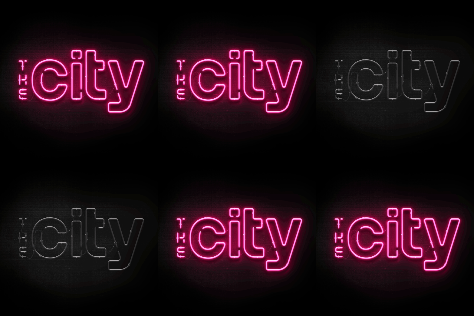
To signify the change in story, scene and mood from season 1 (Chicago), we chose to nod to iconic imagery of ‘the biggest little city’, ultimately deciding to give the podcast cover a seedy neon makeover, with assets that extended to web social and print.
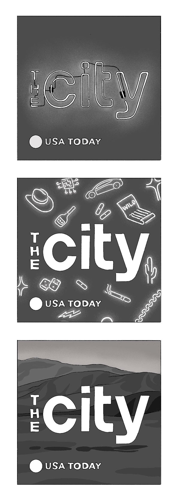
To left: Early cover concepts

