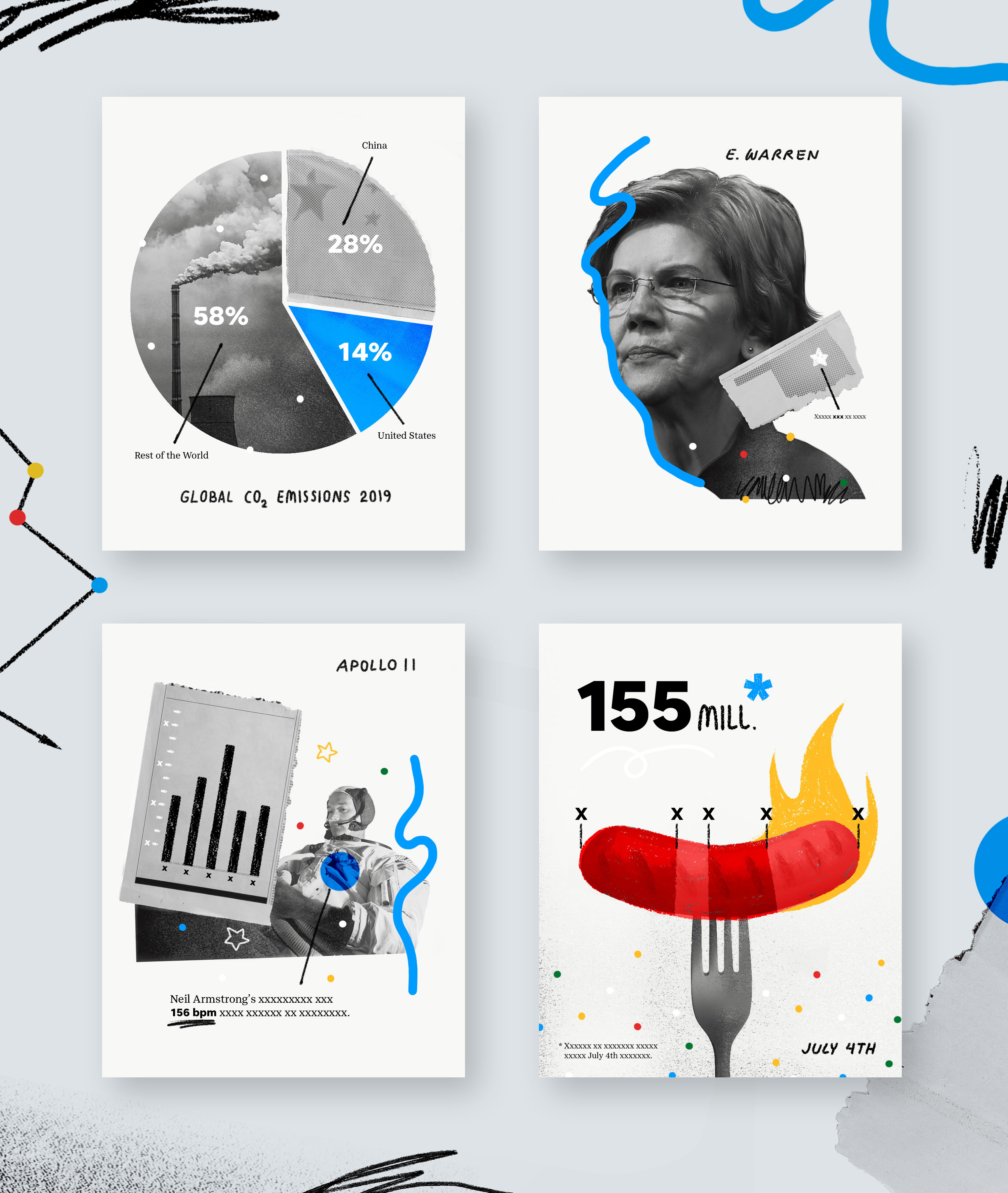
Snapshots
Challenge: How can we begin to develop a new illustrative style for USA TODAY Snapshots that is distinct & own-able, as well as flexible enough to shift between many hands & levels of expertise?
Solve:
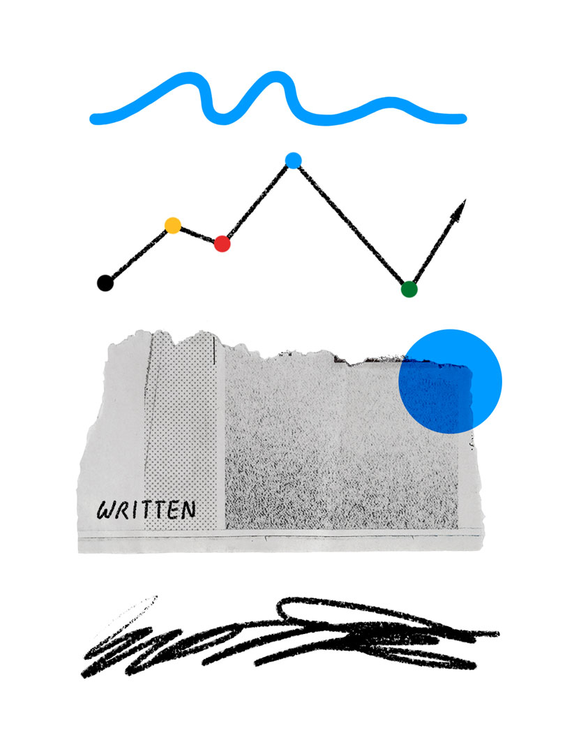
By creating a layered mixed media approach, the differing hands of creators can be used as an added tool instead of a detriment. Leveraging off-kilter alignments, scribbled lines, gradient maps and a minimal color palette, we can establish a look that feels memorable and modern.
By developing a visual experience that avoids the too-colorful and too-cute, we're able to communicate a wide-gamut of tonality- from the most playful to the most serious statistics. Within the shown executions, illustrative elements and color are either ramped up (for things that fall on the neutral/playful end of the spectrum) or pared down (for those that are more serious) as a means of establishing tonality. To maintain this tonal range and balance the harder aspects of collage, a human element is incorporated via hand drawn accents and usage of graphite-like brushes.
For brand equity, emphasis has been placed on the USAT blue as core way-finding color & deliberate points of focus. Similarly, the USAT point was used as graphic element, and some traditional textures (paper, xerox, printed dots) were added as contemporary nods to the brand’s printed history.