
Overview
Brand Overview: “Your Magic will be a place for the already woo to indulge their obsessions, and a safe place for the woo-curious to get their pedicured toes wet. At Your Magic we keep it real. It’s why you trust us, and why you relate so hard to our tough but tender approach to woo. As a part of this new podcast, we’ll show listeners that the mystical arts are neither spooky-scary nor phony-baloney: they are a way to know yourself deeper, a path to mindfulness and self-care, a way to approach the mysteries of this life on planet earth. A way to claim your power, whether you believe in psychic arts or not.” — Michele Tea, Host
Challenge: How can familiar themes (worth, self-care, the mystic, shared community) be leveraged visually in a way that nods to trends and traditions without lacking differentiation?
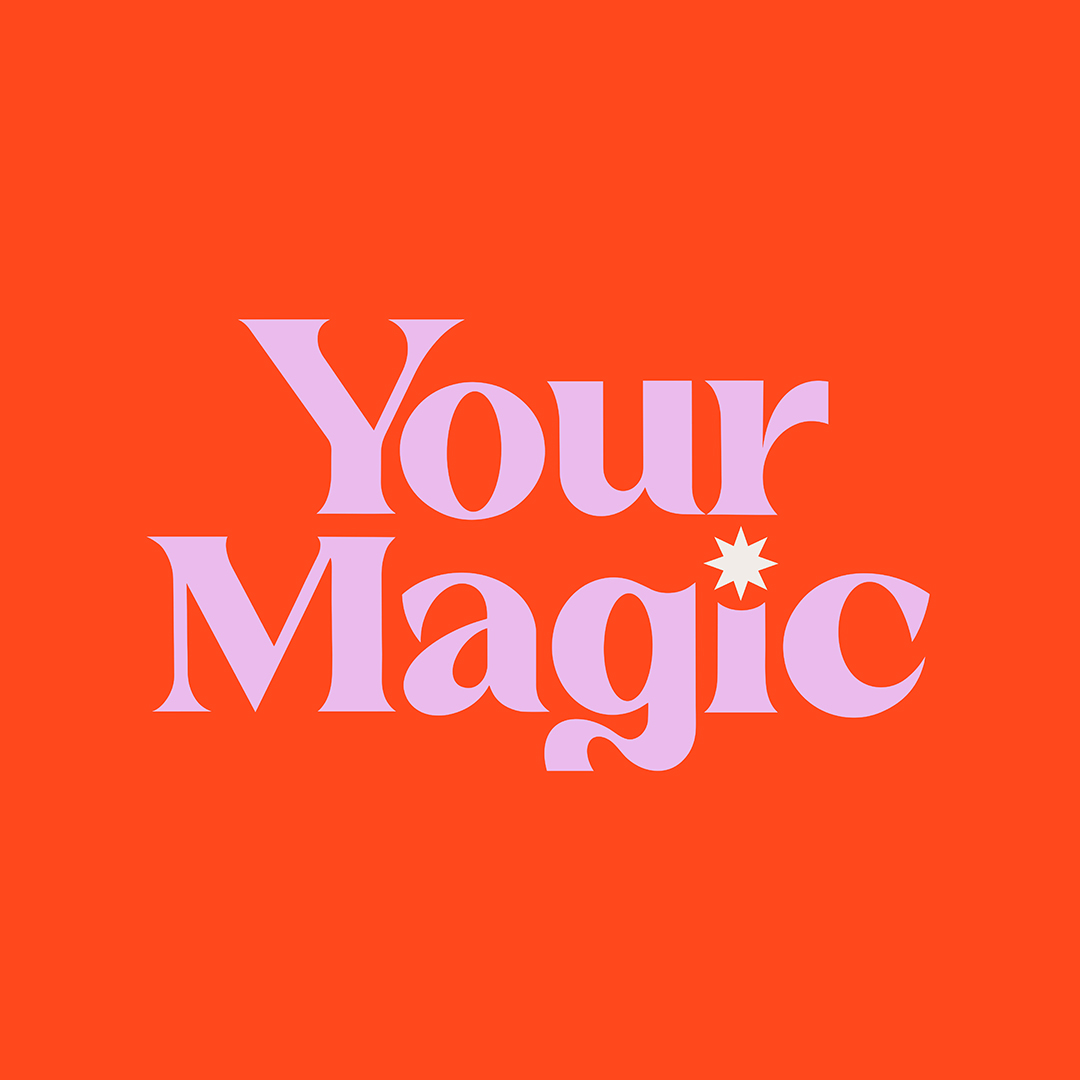
Above: Master Cover
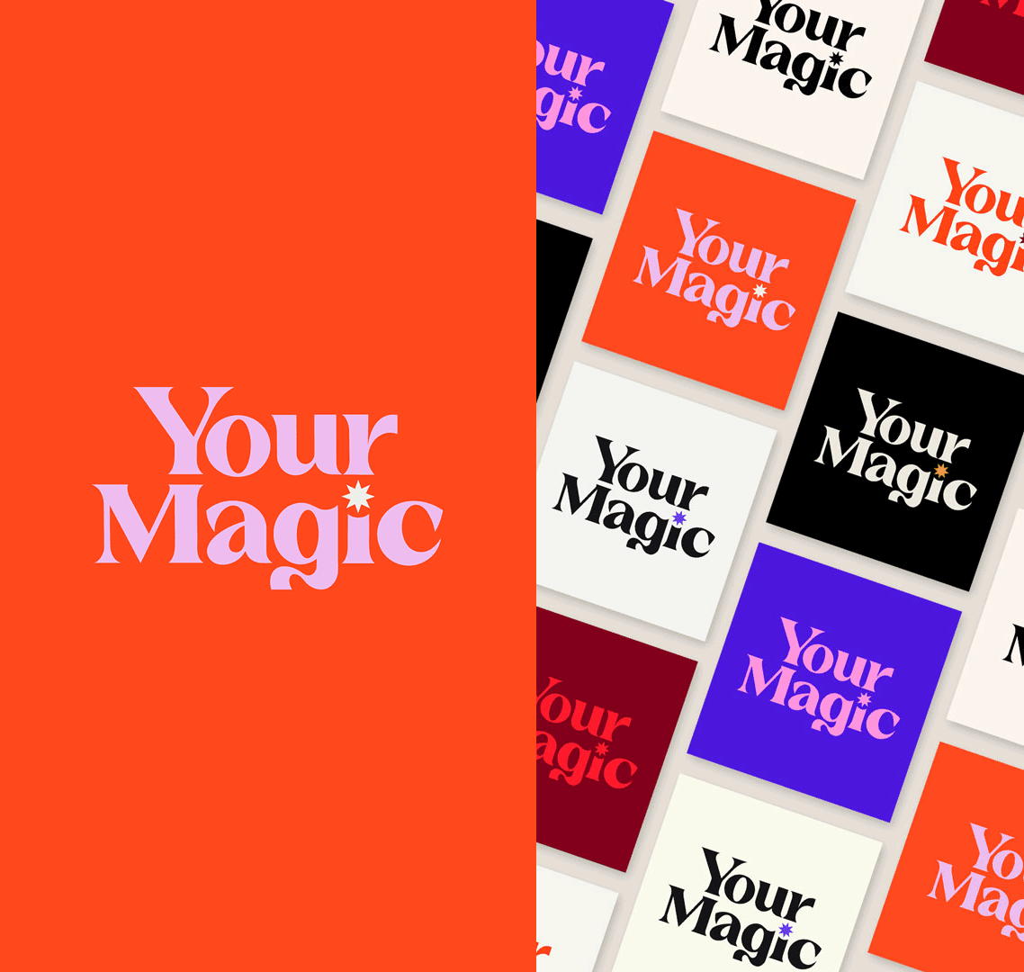
Below: Core color family with alternates
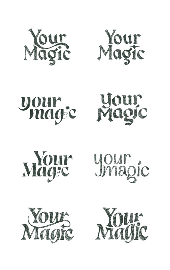
Branding